Gamifying learning for medical students
National Grid · 2025 · In Development
Role
Product Designer
Product
Médisup Connect
Team
Product Designer
Visual Designer
Lead Designer
Timeline
Mar ‘23 – May ‘23
How should french educational institution, Médisup, smooth out the transition from high school to full time medical studies?
Médisup provides learning support to students working towards a career in medicine, and needed to find a way to stand apart from competitor instituions. With the barrier to entry into medical studies being competitive in France, Medisup felt theyc ould bridge the gap between students and their studies through an innovative digital offering. They came to us in order to explore this need in a 6 week vision.
I was in charge of the UX and UI design of the solution.
SOLUTION
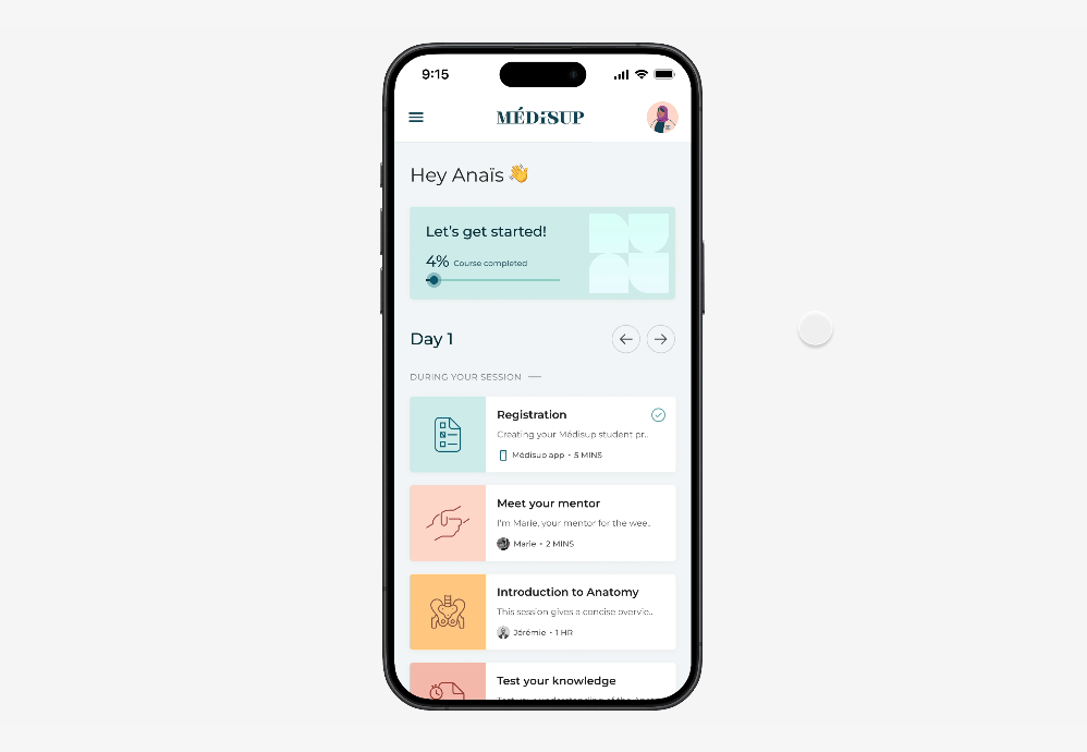
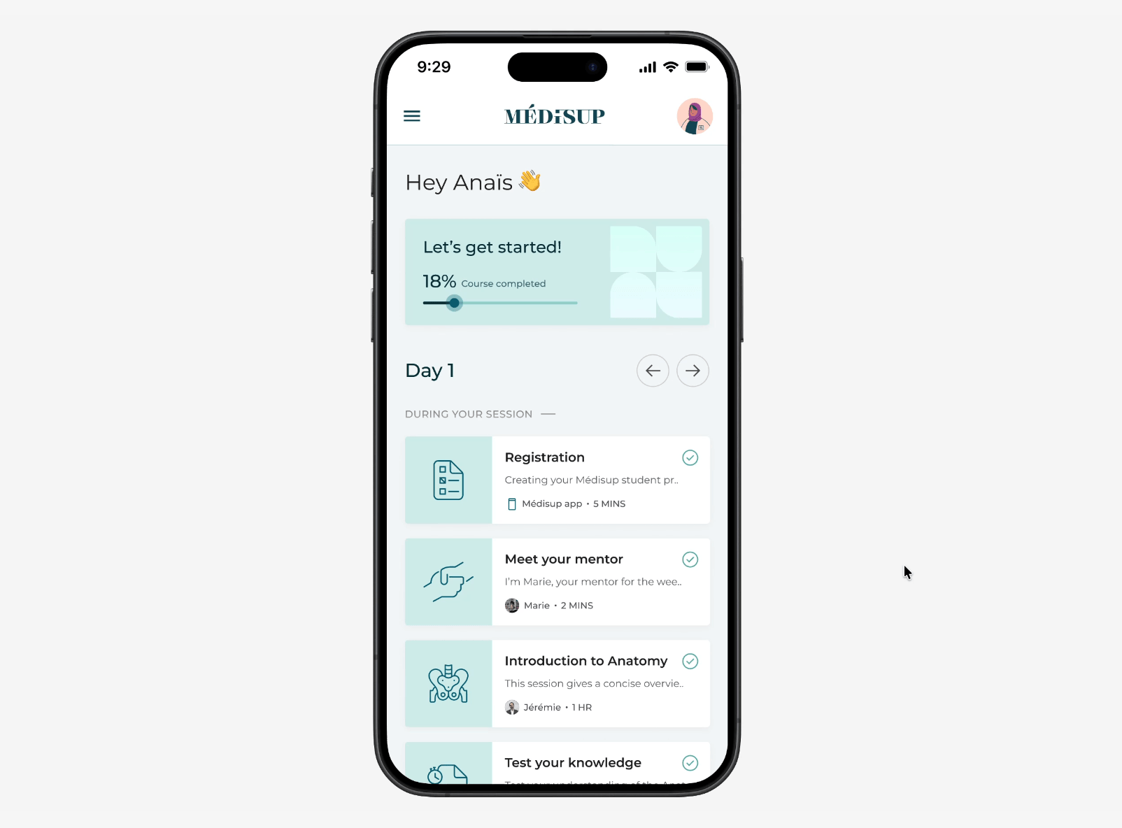
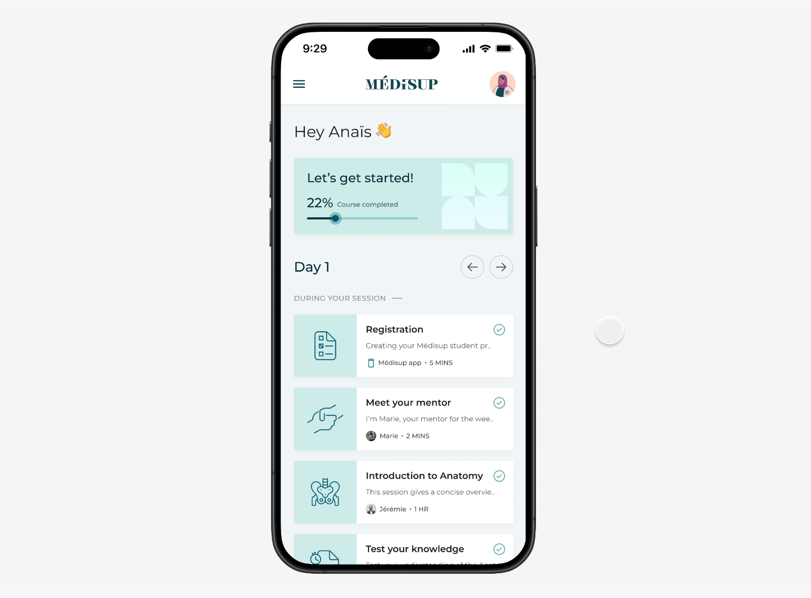
Médisup Connect: A companion app providing gamified guidance and learning support for students.
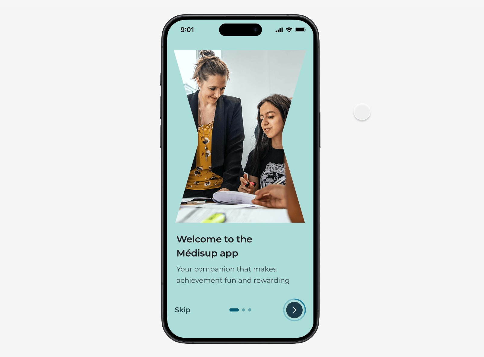
Simple onboarding process
Contextual feedback gathering
Progression to encourage engagement
IMPACT
Médisup was tested with students across France and has positive feedback.
Connect increased engagement with studies by 37% over a 6 month period.
Students found the app to be integral to their learning and progression.
INITIAL OBSERVATIONS
Content failed to keep students engaged due to its manual nature.
Current content was web-based and fragmented across a number of sites and third party apps, making it difficult to access and lacking a personal touch. Speaking with senior teachers and heads of department showed us that this approach was driving students away:
PAIN POINTS
1. Difficult to access content
Including things such as learning materials, quizzes, and documents.
2. No sense of achievement
Students felt uninspired by their studies and uncommitted to achievement.
As we were unable to speak with students directly, we had to lean on a ‘discovery’ piece of work that was previously created. With the overall takeaway being that different types of students needed support to varying degrees. We decided to further investigate these ‘archetypes’ and use them to inform our explorations.
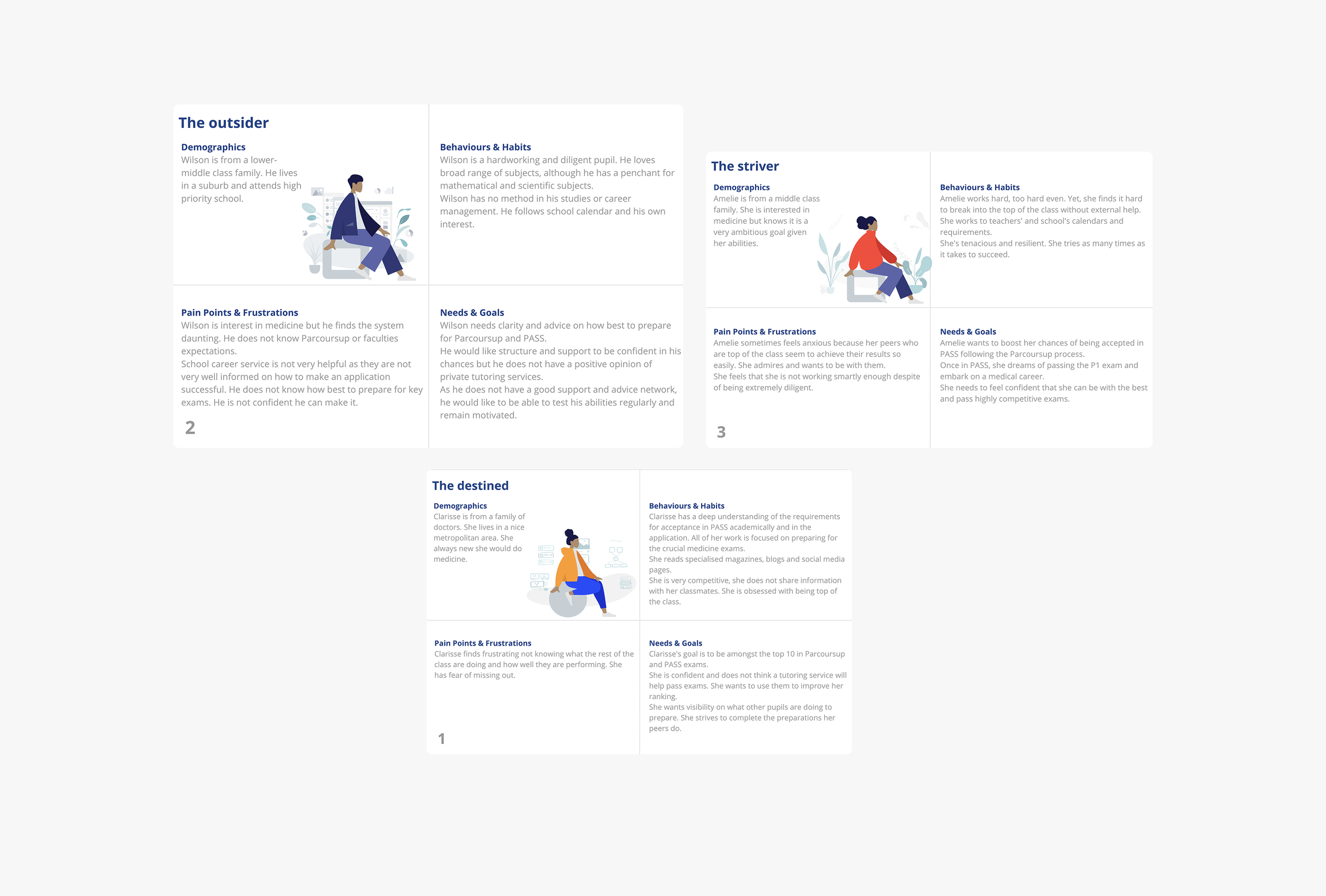
From the personas it was clear that we would need to design for different use cases. For example, user A might need a ‘hands off’ approach to their studies, whereas student B would need a little more hand holding in order to meet their goals. All of this was to be factored in to the flows and interactions.
COMPETITOR RESEARCH
We wanted to build on our assumptions by understudying the market.
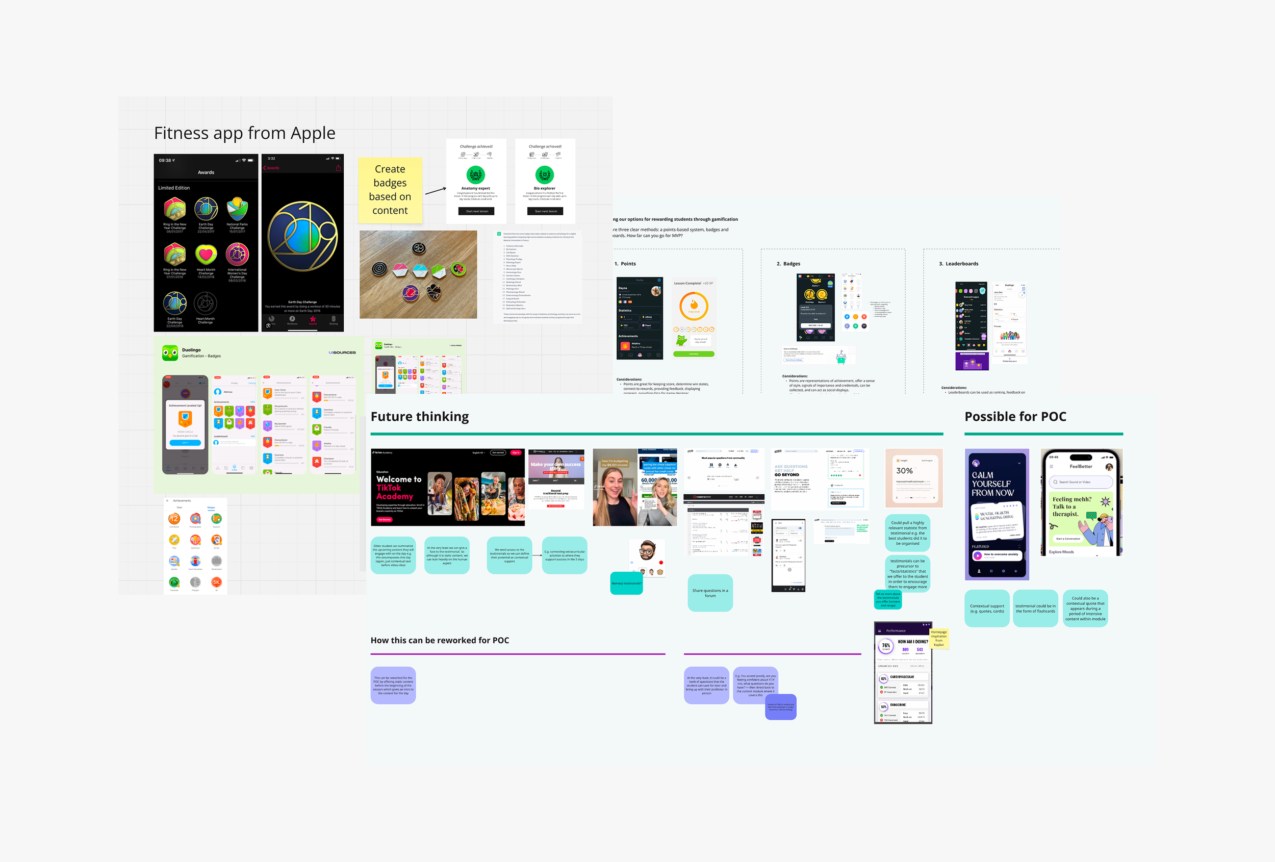
ask for some iamges of current tools not being begginer friendly
We went deep into understanding education apps and trends, researching highly rated apps like x and y, and trying some out ourselves! What we noticed was that context and reward were very much the basis for progression, and so we tried to keep this at the heart of our design explorations.
DESIGN PROCESS
A progression-based companion app with a focus on guidance for different users.
With a good understanding of our users and a strong view of the competitor landscape, we explored different flows and interactions that a student might experience when progressing into their medical studies.
How can we provide contextual support to different kinds of students?
There’s no longer a reason to feel lost or unclear. The companion will reach out during key moments in the student’s day-to-day. Whether it's checking in on a student after the daily quiz, or connecting with a mentor after a stressful day.
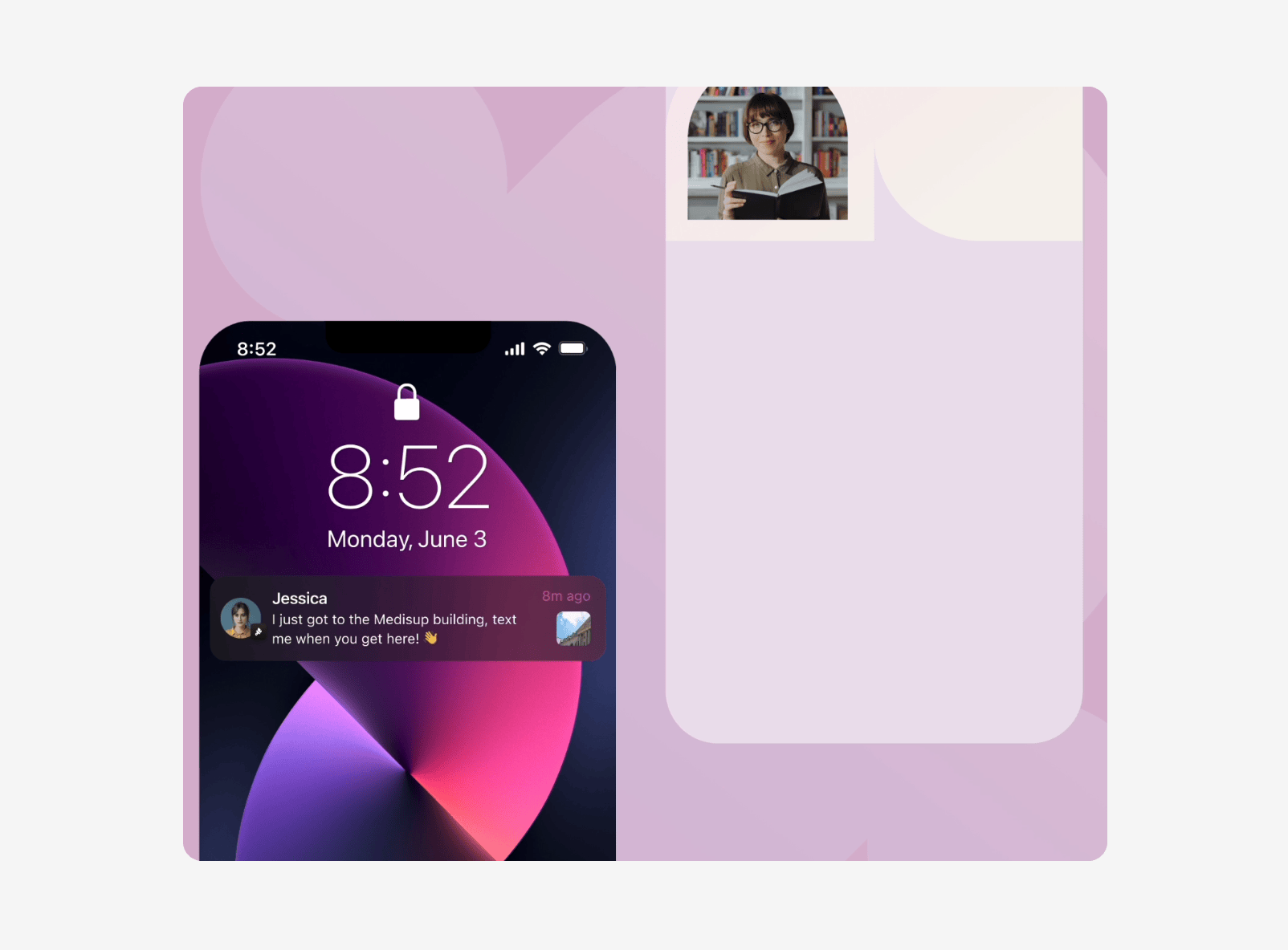
how might we - with accompanying final design
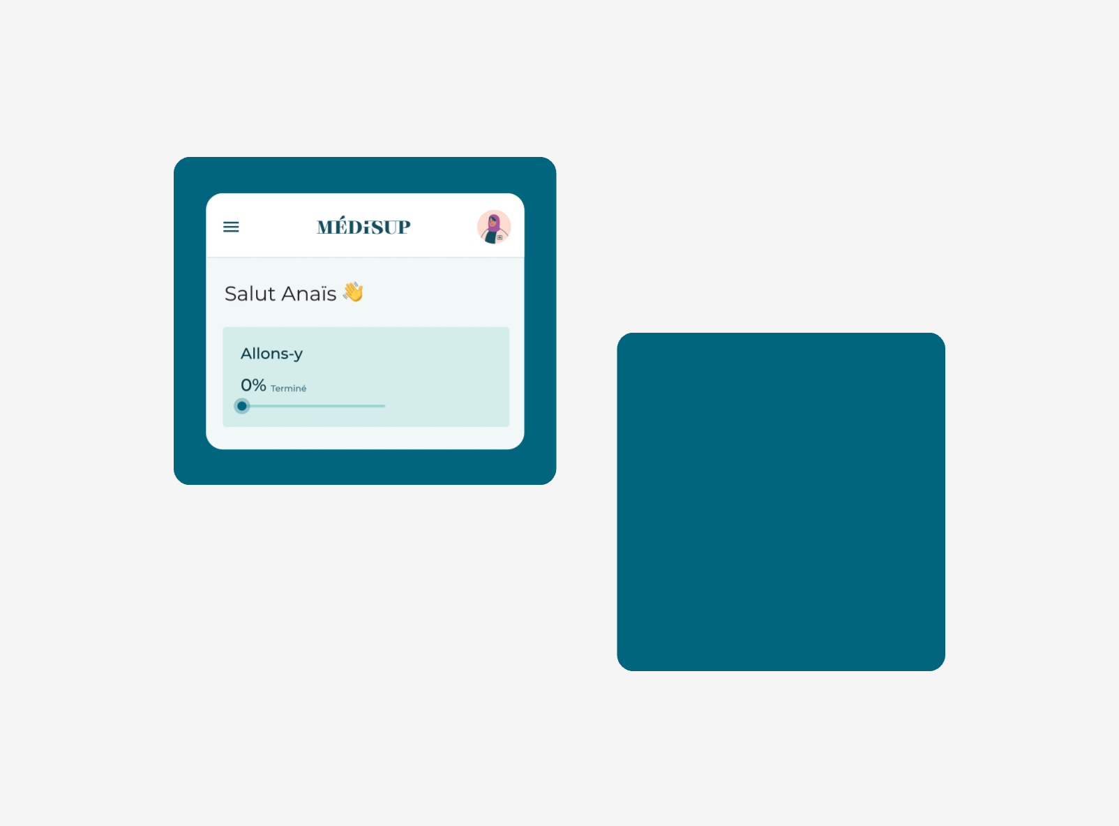
Where could we visualise progress over time?
Students may have once found it difficult to see value in the effort they were putting in. Adding a progress bar and celebratory moments gives a clear sense of ‘forward-movement’. Encouraging them to engage with courses on a deeper level.
how might we - with accompanying final design
Alongside some of these examples, students now have clear access to all the information and tasks they need to complete by the day. They can finally say goodbye to masses of scattered documents.
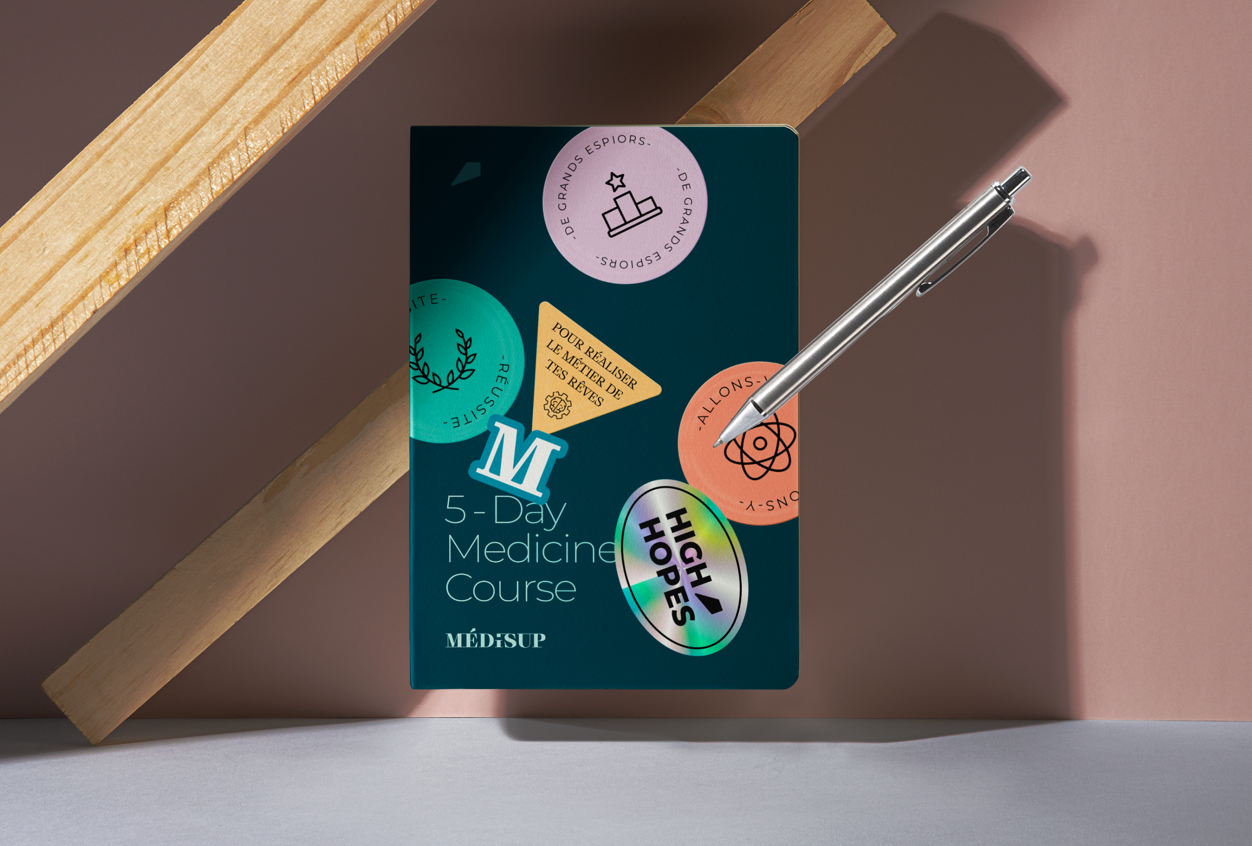
BRAND DESIGN
We brought to life a brand that was inviting yet didn’t detract from key content.
We wanted students to feel like their progress was worth it, and once way to do this was to elevate celebratory screens and micro-interactions with bright colours, meaningful imagery, and and clean typography.
Final screen like chen has done with some annotations
CONCLUSION
Médisup Connect is now live on the App store.
After creating this vision for Médisup, they went on to develop the app with another provider. While this was disappointing for us, we were glad that the vision inspired our stakeholders to take the next step.