Reducing the refund rate for guitar sellers on Reverb’s marketplace.
PROJECT I personal project with guidance from mentor
ROLE I working through end to end process: user research, requirements, design, testing
DATE I 24/06/21
Buyer refunds caused by a lack of listing depth and accuracy were reducing the bottom line for Reverb as a company. I needed to assess how people made decisions when creating a listing and why these decisions were leading to many unhappy customers?
Reverb’s listing page has always been simple in design, making it quick and easy for sellers to list products. However, buyers continued to leave negative reviews regarding sellers who were untruthful or provided inaccurate information. Reverb had sacrificed understanding for efficiency.
The goal was not necessarily to overhaul the entire listing process, but to integrate new features capable of bridging the gap of understanding between sellers and potential buyers. Accessing articles and helpful information was disjointed and laborious. This created a back and forth between sellers and buyers, whereby time was spent clarifying info. or, in the worst case, initiating refunds.

↑ Final prototype showing various features that help sellers create more detailed listings
Making learning a standard part of the process
The central change required for the listing process was making sellers aware about what info. buyers + Reverb were looking for. I landed on two methods of achieving this: informing sellers at the beginning of each stage + during every relevant input. This dealt with two use cases, a seller who has very limited listing knowledge, and a seller who has a general idea but is unaware of the specifics. That way each use case can be educated when it’s relevant to them.

↑ Flow from introductory page to adding photos
Giving sellers the option to learn more
A simple change that resulted in greater engagement with tips and articles was giving ‘help’ buttons a purpose. Before, sellers couldn’t find info. that related directly to the input they were on – they would have to sift through external articles via an out-of-the-way side bar containing links. Slotting these links directly under relevant tips and inputs grouped them for easy learning.

↑ The original mobile version does not even contain the tips/links found in its desktop counterpart
Sifting through navigable info. rather than long articles
One big challenge I faced was overcoming structural constraints. Through reading articles and unhappy buyer reviews, I found there to be a lot of relevant information that would help sellers improve their listings. However, not all of it could be housed within a mobile view without unnecessarily increasing cognitive load. Therefore, through prioritising said content + utilising considered typography, I was able to make this info. easily scannable for sellers.

↑ Articles and tips can be quite lengthy and needed clean typographic treatment
The research – Reverb as a guide as much as a provider
The main goal of the research was to uncover what level of ‘listing creation’ knowledge sellers begun the process with. My second goal was to understand how sellers interacted with Reverb’s system and why this caused them to make certain decisions. If I was to work with Reverb on this project directly, at his point it would be important to align with the PM + director + engineers to find out what they want to learn and expect from the research.
I interviewed 5 people who had varying experiences with different listing platforms and utilised a thematic analysis to pull out meaningful data and define points of further exploration.
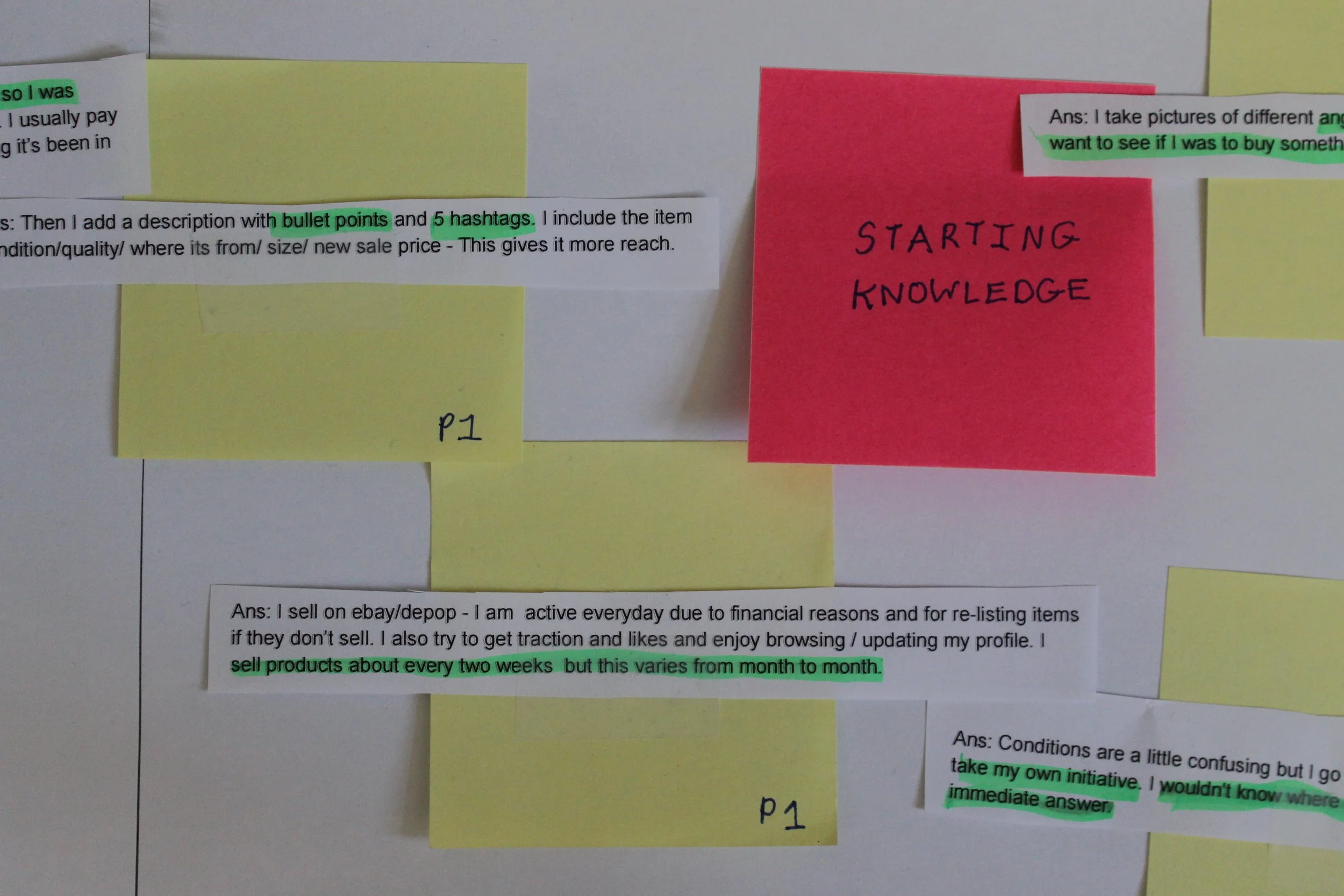
↑ A snippet of the thematic analysis showing the data related to the code ‘starting knowledge’

↑ Original desktop experience was unfocused in what it was trying to do and say
Early findings – seller-company relationships defined experience
Successful sellers used various tools provided by the company e.g. tips during the process and emails containing articles. Successful buyers had to find workarounds to clarify information e.g. seeing other customer images/reviews. This led to a new theme being uncovered - Brand offerings - which suggested that sellers/buyers were partial to various companies based on their relationships towards them. For instance, if eBay had a good reputation for selling electronics, a seller was more likely to use their site. Although this was helpful to uncover, I needed to confirm whether this was where Reverb had been going wrong.

↑ High level visual representation of Reverb’s relationship with sellers
Social listening clarified themes
I read through a large portion of customer reviews to get a reliable understanding of user sentiment. Many buyers said that sellers were untruthful and that Reverb were apathetic during the refund process. Whilst it seemed irresponsible to suggest that sellers were deliberately presenting false information, it was clear , more so, that Reverb had failed to understand the role they play in the interaction between sellers/buyers.

↑ Reviews from unhappy buyers gave insight into reverbs failings with sellers
How is this all in the best interests of the business?
By fulfilling the needs of sellers, it was clear that the short term goals of the business could be met too. These goals include decreasing the refund rate of guitars and maintaining the current user-base. An example is where CEO, David Mandelbrot’s, talks about driving growth “ by improving the tools that enable sellers of all sizes to connect with more buyers.” Product director, Aaron Enequist-leiker, also desires less unnecessary seller-company interaction which complements the sellers need of listing a guitar efficiently. By attaching these business goals to various aspects of a sellers journey, I was able to better prioritise pain points and turn them into opportunities for exploration.

↑ User journey map: seller needs in red/ business needs in blue/ stakeholder input in amber
Pain points to focus on and prioritise
Through the user journey map, it was clear to see what seller pain points were: sellers were unaware about what information they needed to provide in listings, they did not have the time to spend searching for and reading long articles and were having a hard time getting on board with Reverb as a company. This came together into one clear success metric: Reduce number of refunds by improving the ‘listing creation’ page so that sellers can present required information to buyers. I used Spotify’s Thoughtful Execution Framework to unearth opportunities from this metric. I found that whilst opportunity 1 would solve Reverb’s short term problems, opportunities 2 and 3 still needed to be integrated and worked on in the long term.

↑ My interpretation of Spotify’s Thoughtful Execution Framework
Iteration, iteration, iteration
I went through multiple rounds of testing the various features that would hope sellers to provide the information that Reverb was looking for. However, before that I did some high level sketching to get a basic idea of structure and hierarchy.
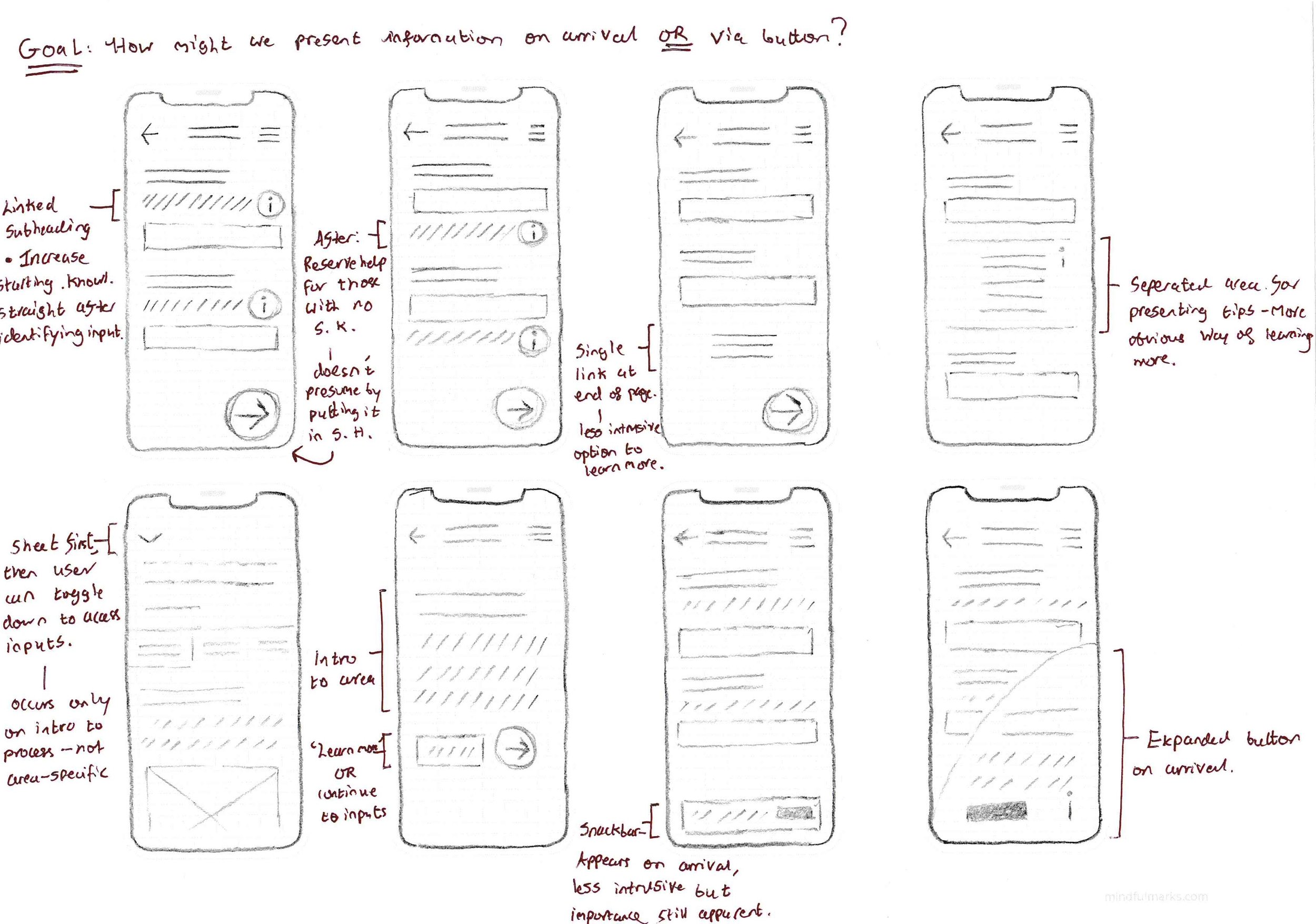
↑ Early sketches of locating help/tips. I was focused on integrating features in the listing process itself

Early designs
I took the more refined variations to Figma and began testing my solutions on users of varying online selling knowledge. After working through the responses, I went back to iterating. I found that my initial solution of forcing dialogue boxes of tips upon users was causing decreased engagement. My mentor made it clear to me that this was going to be a challenge of utilising Tesler’s law, whereby I was underestimating the users ability to interact with the various features I needed to include.

↑ Moving from imposing on sellers to guiding sellers
Exploring a guided approach
This feedback brought me back to the project goals - strengthening the relationship between sellers, buyers and Reverb. So I moved away from imposing content for the sake of achieving a certain result, and instead focused on guiding sellers into the right headspace for selling their guitar. No feature would become ‘fluff’ or be wasted, everything on each page would contribute to more informed seller decisions.

↑ Sellers became easier to guide when content was split over many pages
The strongest flow
After testing the combination of multi-page guidance + stringent single page content, I landed on a flow that allowed sellers to provide the information Reverb were looking for in an efficient manner. I inserted ‘quick tips’ which provided context, easily visible ‘help’ buttons to learn more, and multiple reminders to double-check the information sellers had provided. Intelligent copy also allowed Reverb to conversate with sellers so as to make this checking relevant and useful.

↑ The final prototype was easy to follow and didn’t sacrifice efficiency
Cleaning up visual design further improved relationship
I noticed that many of the visual treatments and components of the mobile version lacked consistency with the desktop version and further created a sense of alienation with sellers. For instance, headings were allocated to multiple sections on a single and so there was no clear goal for the user. I changed this by using a large bold heading to clearly voice the purpose of each page, and left smaller headings for specific inputs. Buttons also had no context attached to them, leaving the seller questioning or not even thinking about what Reverb were looking for. For example, I attached a short descriptor to the ‘add photos’ button and a bright background to signify its purpose and importance. Whilst I stuck to the original design language by and large, hierarchies were shifted to fit the more guided copy. Again, the aim was to fix short term goals through subtle integrations, not to necessarily revamp Reverb’s design system.

↑ The original visual design gave no sense of direction
How my solutions can contribute positively to Reverb’s future
My solutions found success during usability testing, with 4/5 users providing much more detailed listings as the tests went on. Although this was a personal project and only so many resources could be accessed, I uncovered a lot about Reverb’s headspace in relation to their users. Reverb, at the very least, needs to move from being a provider of a service to a guide of a process. With a slowly but surely disenfranchised seller/buyer-base it seems that through considered design and relevant copy, Reverb could ‘lead the way’ for both their users and the music gear-selling market.
What I learned
The connections between user and business are closer than we may anticipate -
The user journey map showed that users and business needs had a direct affect on each other. For instance, by considering the CEO’s desire for a mission-driven community, it became clear what kind of copy I needed to use to guide sellers. By the same token, ‘fixing copy’ as a user need brought into focus Reverb’s long term brand image and how this could be affected.
Don’t overpromise and underdeliver -
By spending a little longer on uncovering areas of exploration through extended research, I was able to more accurately define an MVP over something that is not usable or shippable from the get go.
Choosing what to tackle at a later date can be challenging -
With the wealth of research I had done, I uncovered many great use cases to work on. However, considering the short-term needs of the business, many features were unrealistic or too costly. I had to work out what could be fixed rapidly and with the biggest effect to Reverb’s growing refund rate and user drop off.